Announcement

Collapse
No announcement yet.

Which one do you prefer?

Collapse
X
 
  • Filter
  • Time
  • Show
Clear All
new posts

  • #16
    pqj:

    Got the email and have responded. Thanks very much

    Terry
    Terry Davidson
    IBSF Master Coach & Examiner

    Comment


    • #17
      Originally Posted by poolqjunkie View Post
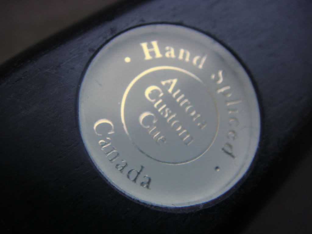
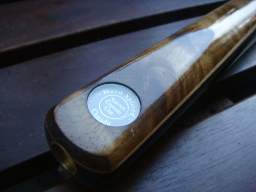
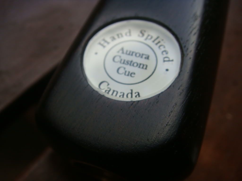
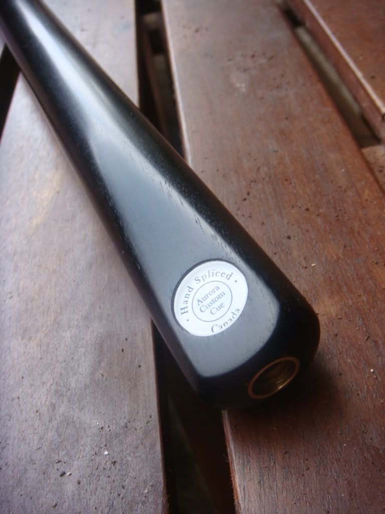
      I would appreciate your feedback on which badge would you prefer?
      1. Black fonts
      2. Platinum fonts
      3. Black on simple cues and platinum on more complex/fancy designs
      Thank you so much.


      I would go with the term Hand Crafted, and don't know if there is enough
      space but how about a Canadian Flag or red Maple Leaf?
      These are great cue's could you PM the price ranges for your cues, and
      approximate time frame to make a cue for me? If possilbe thanks.

      Comment


      • #18
        Originally Posted by bob1 View Post
        I would go with the term Hand Crafted, and don't know if there is enough
        space but how about a Canadian Flag or red Maple Leaf?
        These are great cue's could you PM the price ranges for your cues, and
        approximate time frame to make a cue for me? If possilbe thanks.
        PM sent, thank you for your interest in my work.
        Last edited by poolqjunkie; 15 August 2010, 05:21 AM.
        www.AuroraCues.com

        Comment


        • #19
          When I click on the link left by jrc750, it opens one of my files. How does this happen?
          :snooker:

          Comment


          • #20
            Black fonts work for me.
            The bitter taste of poor quality remains long after the sweetness of low price is forgotten.

            Comment


            • #21
              Originally Posted by willytan View Post
              I still prefer the classical black fonts with white/cream back ground. It find that it will be better if the fonts are bold.

              That is just my take on the choice.
              I'm with willy

              Comment


              • #22
                fonts

                I like both as long as is a AURORA CUE I like it ALLLLLLLLLLL

                Comment


                • #23
                  Thanks very much everyone, I really appreciate your comment and feedback.
                  www.AuroraCues.com

                  Comment


                  • #24
                    I like the platinum one but not sure about the finish that you can see through to the edge.

                    Comment


                    • #25
                      i would go for no 3

                      Comment


                      • #26
                        I prefer Black on simple cues and platinum on more complex/fancy designs

                        Comment

                        Working...
                        X